Leading the design of a banking platform at FintechLab
Head of Product Design
2016-2019
Fintech • BaaS
Web, Mobile
TL;DR
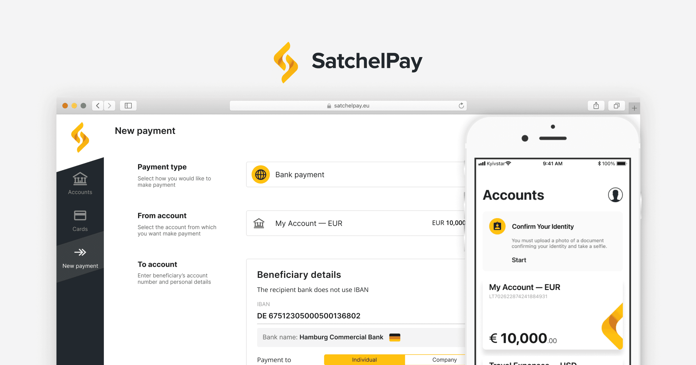
FintechLab built a payment and banking platform designed for white-label distribution. Alongside platform development, the company launched SatchelPay (later Satchel) — an Electronic Money Institution (EMI) licensed in Lithuania — both as a revenue stream and a production-grade demo of the white-label platform. In practice, SatchelPay acted as FintechLab’s first white-label customer.
When I joined, there was no unified interaction architecture. Operations, compliance, and engineering all held fragmented interpretations of how core processes should work. As the founding Product Designer and later Head of Product Design, I defined the platform’s UX foundation: mapping operational processes, designing internal operator tools, translating compliance-heavy flows into clear customer experiences, and restructuring the system into a modular, white-label configuration.
This foundation later powered every client implementation — including FintechLab’s own EMI.
Note: Back Office is the internal web app used by operations teams to handle onboarding, verification, payments, cards, and support. Client Office is the web and mobile experience clients use to register, verify their identity, manage accounts, and make payments.
Mission: Bring clarity and coherence to a dual-purpose fintech platform under strict regulatory constraints
FintechLab operated two tightly linked products:
a white-label payment and banking platform sold to financial institutions, and
SatchelPay, its own EMI running on the same backend.
Improvements to SatchelPay strengthened the underlying platform, and platform upgrades had to work reliably for SatchelPay’s customers. But in reality, both products were built on shared backend logic without a shared interaction model. Teams interpreted workflows differently, and engineering often implemented features based on inconsistent assumptions.
Money movement, onboarding, limits, exception handling, and operator workflows all carried compliance risk when executed inconsistently.
My mission was to bring structure to this ambiguity by:
understanding how the business truly operated;
clarifying how engineering expected the system to behave;
translating both into clear, predictable interaction flows usable across SatchelPay and all future white-label clients.
The goal was not to redefine banking architecture, but to make a complex, regulated system understandable, consistent, and designable — creating a single source of truth across teams.
Establishing the UX foundation (2016–2017)
Understanding and translating operational workflows
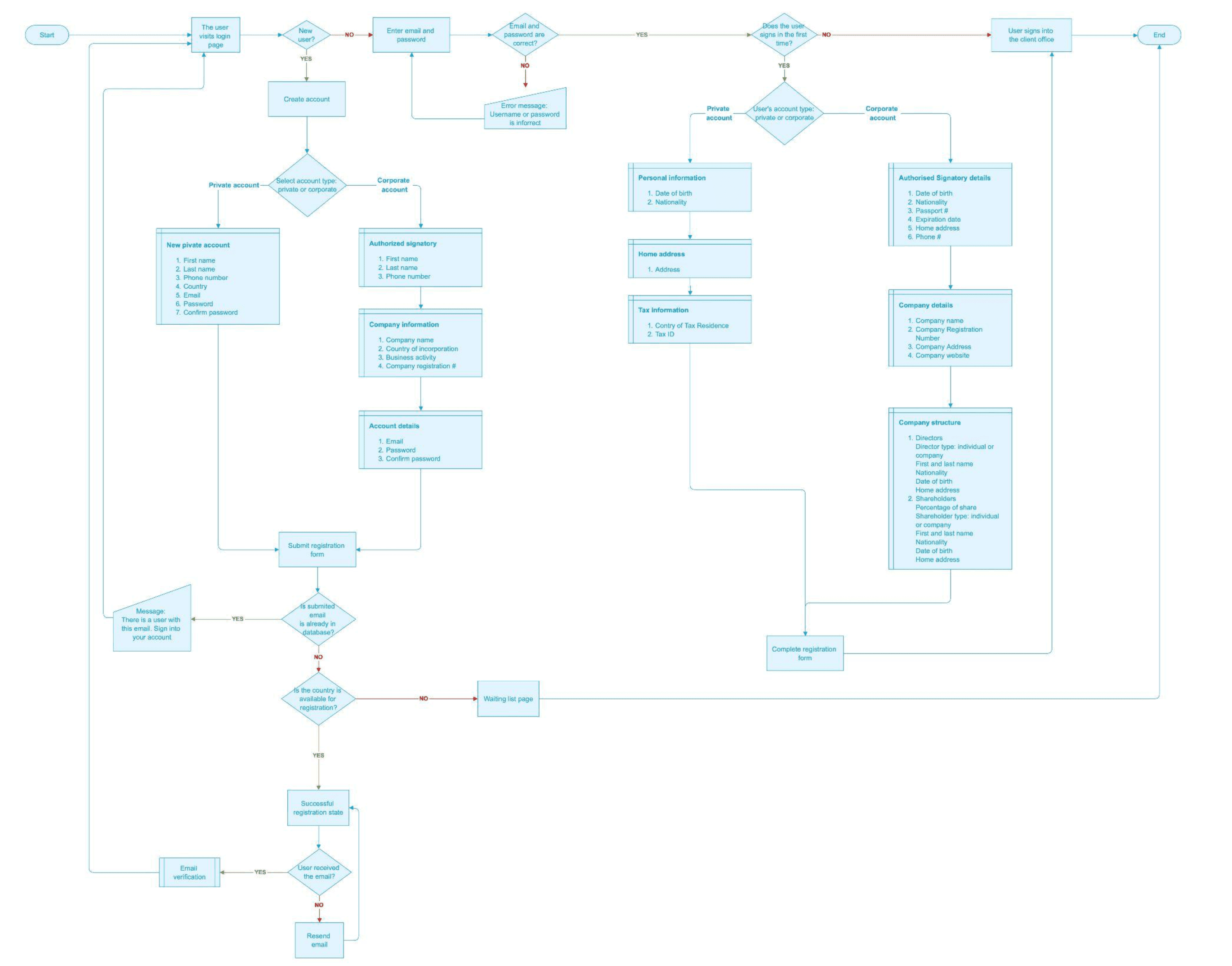
I conducted deep-dive working sessions with compliance, risk, operations, engineering, and customer support to understand how money movement, approvals, card operations, and account actions were actually handled in practice. Each group had its own interpretation of the system, and many steps existed only as tribal knowledge.
Using these inputs, I assembled service blueprints and interaction maps, consolidating:
money transfer and approval sequences
limit checks and escalation paths
risk and exception-handling behaviors
card issuing and lifecycle events
operator responsibilities and support resolutions
error states, lock/unlock logic, and compliance-driven decision points
The goal wasn’t to redesign banking architecture, but to translate business rules and engineering logic into clear, predictable interaction flows that teams could align around. The resulting process maps (the only surviving example being the Authentication & Registration flow presented below) became a shared reference that guided both product decisions and UI patterns.
While much of my focus was on the Back Office, because its complexity and regulatory constraints required deeper structural clarity, I delegated the Client Office design work to one of my designers. Their level of creativity and execution made them an excellent fit for the customer-facing UI, freeing me to concentrate on the operational workflows that posed the highest risk and carried the most dependencies across compliance, engineering, and operations.
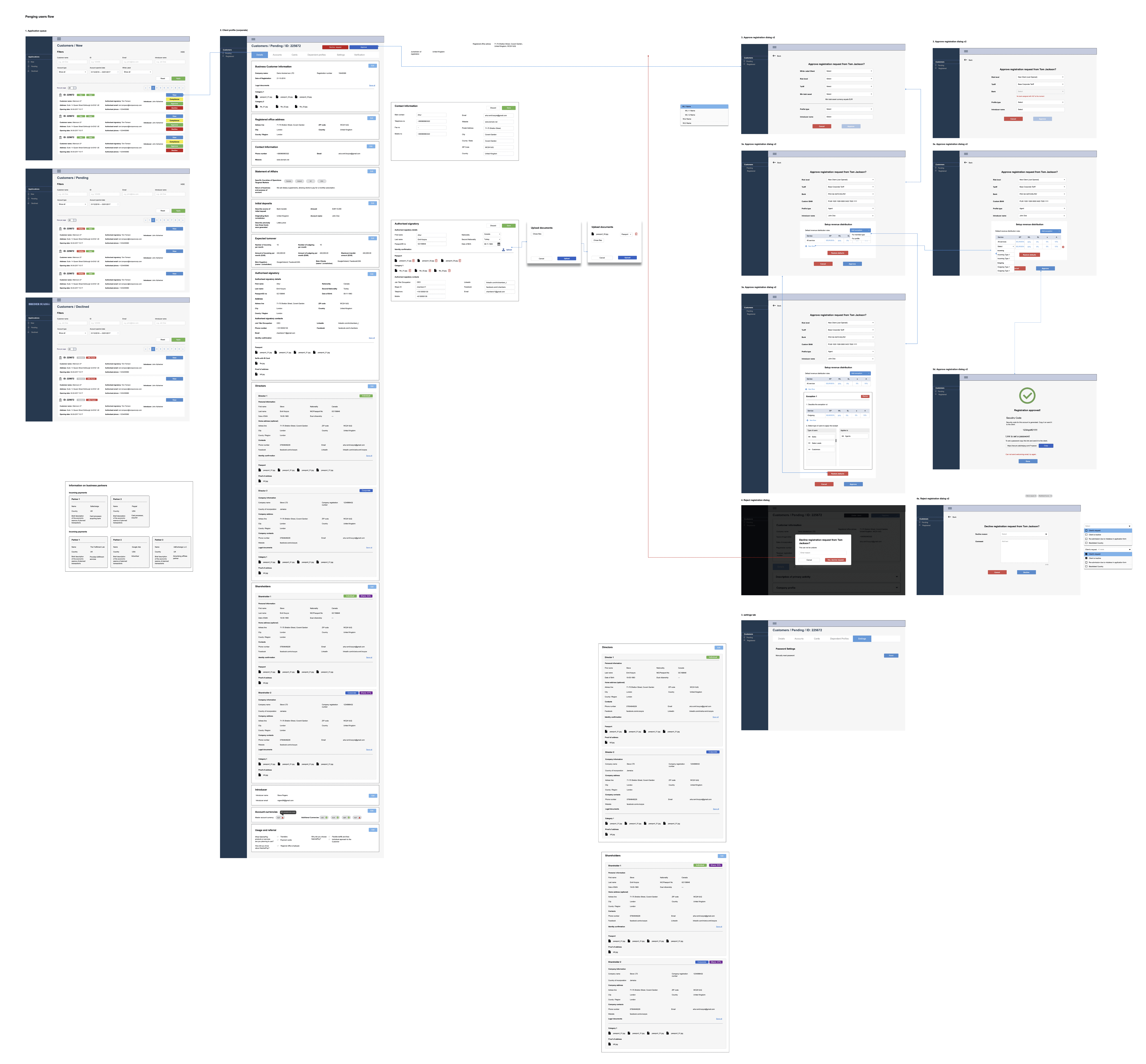
Designing the internal banking interface
Internal operators (accountants, risk analysts, and support agents) relied on the platform to manage high-frequency, compliance-sensitive tasks. Before the redesign, much of their workflow depended on tacit knowledge, inconsistent UI patterns, and screens that exposed raw data without guiding the operator toward the next actionable step.
To accelerate both design and development, the engineering team proposed using a pre-built Angular template for the internal tools. Instead of producing high-fidelity mocks for every state, we agreed on a faster delivery model: I created wireframes and wireflows in Moqups, documented the interaction logic, and handed everything off through detailed user stories. This allowed engineering to implement quickly while still maintaining clarity and consistency across the interface.
My contributions
My role was to translate operational routines into clearer, more predictable interaction patterns while working within the lightweight handoff process:
Designed operator workspaces around tasks and actions, replacing unstructured data-heavy screens.
Structured multi-step flows for reviews, approvals, and exception handling so operators always understood the next required step.
Reduced friction by grouping related tools and removing redundant navigation
Introduced audit-friendly interaction patterns where every action had a clear state, history, and outcome.
Clarified error states, limits, lock/unlock logic, and system feedback to reduce support escalations and misinterpretation.
Delivered wireframes, logic flows, and user stories that engineering could directly map to the Angular template components.
These improvements made the interface easier to navigate, decreased reliance on tribal knowledge, and helped operators complete tasks with greater confidence and consistency — even with a lightweight design-to-engineering workflow.
Improving efficiency through data-driven redesigns (2018-2019)
Once the foundational workflows were aligned, the next phase focused on reducing friction in the areas where users and operators experienced the most pain. To identify these problems with precision, I combined insights from our internal support data with two customer surveys and qualitative interviews.
The surveys revealed a consistent pattern. Overall satisfaction was high (~80%), but only ~46% felt the product fully met their needs, indicating clear gaps in feature depth and clarity of expectations. Users valued convenience and ease of use, yet reported several recurring issues:
concerns about security, as passwords and codes were exchanged by email
frustration with missing notifications about product changes
a need for faster, more predictable transfers
requests for practical tools such as repeat payments, templates, and printable statements
A later survey reinforced these themes. Desktop remained the preferred platform for managing finances, while mobile satisfaction was significantly lower, with almost half of the respondents not using the mobile app at all. Net Promoter Score improved from –13% to +7%, suggesting better loyalty but still below typical fintech benchmarks. Email remained the most trusted communication channel, and SMS was the preferred 2FA method — despite up to 25% of users choosing not to enable two-factor authentication at all.
To deepen insight, I conducted 12 long-form interviews with freelancers, traders, digital agencies, and legal intermediaries across the EU and UK (in English and Russian). These conversations highlighted several systemic issues that surveys alone could not surface:
Onboarding felt unpredictable, often taking weeks instead of the expected five days.
Cross-border payments lacked transparency, with unclear statuses and long settlement times causing operational delays.
Users associated trust with clarity, not branding — they needed transparent fees, predictable timelines, and visible system states.
Many operated across multiple currencies and jurisdictions, expecting stable transfers and consistent FX rules.
A substantial share of business users relied on intermediaries to complete onboarding and document handling on their behalf, exposing gaps in guidance and communication.
These insights shaped the product direction by prioritizing predictable onboarding flows, clearer compliance communication, transparent payment states, simplified multi-currency interactions, and a desktop-optimized interface aligned to how users actually worked.
Solutions: Payment Redesign and Updated Onboarding (Web & Mobile)
Research identified payments and onboarding as the most consequential friction points — one being the most frequent action, the other the highest-risk abandonment stage.
I redesigned both flows across web and mobile, aligning them with user expectations, compliance rules, and operator workflows.
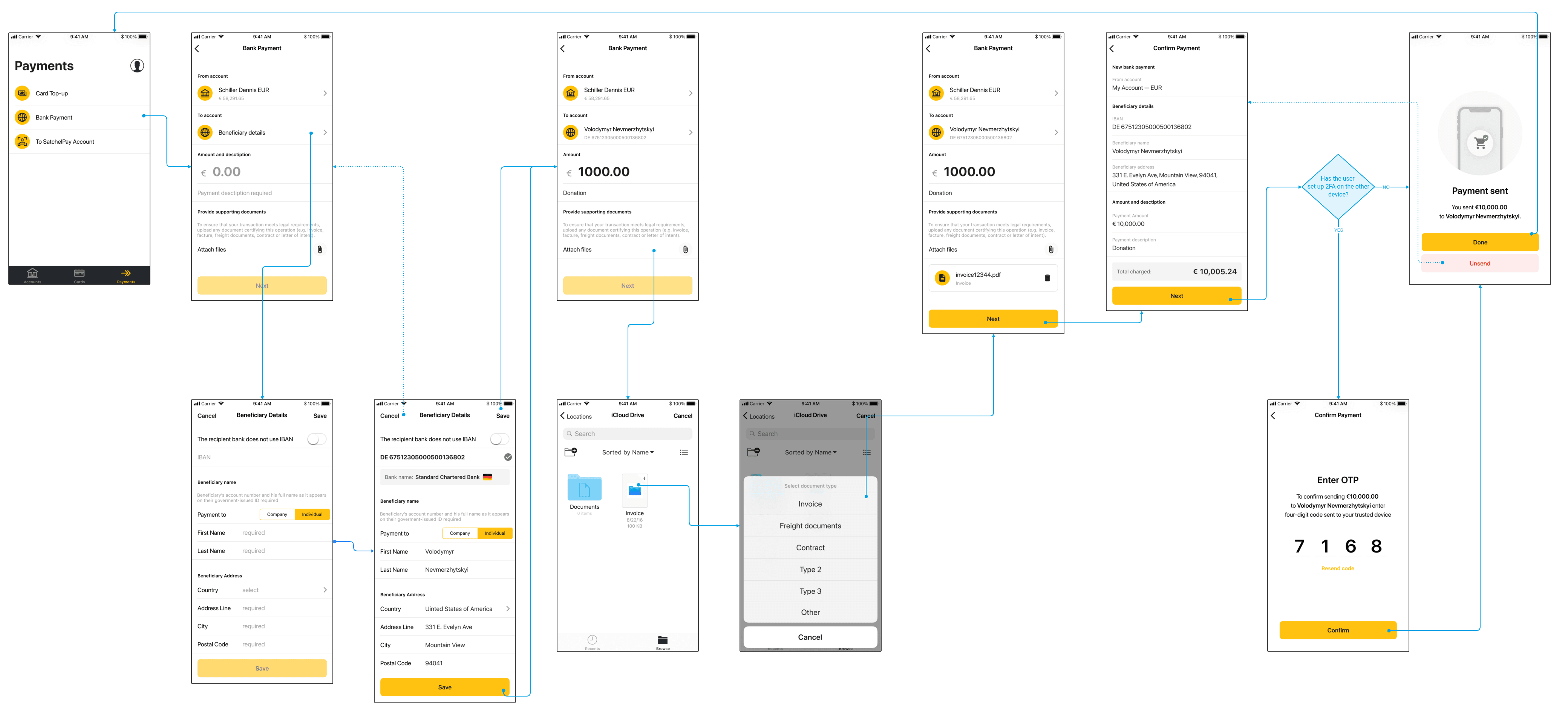
Payment Flow Redesign
The redesign minimized user errors, improved transparency, and reduced operator intervention — addressing the highest-impact pain points in daily use.
Key improvements
Step-by-step architecture replacing flat, error-prone forms
Inline validation explaining limits, requirements, and field behaviors
Clear status visibility aligned with internal operator stages
Saved beneficiaries and repeat templates to reduce repetitive input
Printable receipts and statements, reducing support burden
Updated Onboarding Process (Web & Mobile)
Onboarding was crucial for trust and conversion. By reorganizing it around clarity and compliance-aligned sequencing, we reduced user confusion, decreased incomplete submissions, and helped intermediaries support their clients more effectively.
Key improvements
Predictable, guided sequencing clarifying what happens next and why
Progressive disclosure to avoid overwhelming users up front
Improved document capture with better instructions and validation on mobile
Clear expectations around verification timelines and next steps
Consistent logic between web and mobile for intermediaries and business clients
Scaling the platform into a white-label system (2019)
As adoption grew, FintechLab shifted from a single product to a multi-client strategy. The platform needed to support different branding, rules, and operational models without fragmenting the experience.
What I redesigned
Modularized workflows for client-specific limits, fees, card programs, and KYC rules
Separated core logic from presentation for rapid branding
Created reusable UI components across implementations
Mapped products, fee plans, account types, and permissions
Ensured client customizations remained compliant and stable
This shift enabled faster onboarding of new clients, lowered implementation costs, and allowed FintechLab to scale its platform into a multi-tenant fintech infrastructure.
Results & Impact
Clearer workflows reduced operator errors and support escalations.
Improved internal tools accelerated task resolution and support handling.
A unified UX foundation accelerated development and reduced customization costs.
Shared interaction patterns aligned operations, compliance, and engineering around one source of truth.
Reusable components enabled faster delivery of new features and smoother onboarding of new team members.
The platform successfully scaled from a single EMI to multiple white-label clients.
Lower operational overhead and clearer compliance logic increased reliability and opened new business opportunities.
Strengthened audit readiness and regulatory consistency across the system.