Podiya: Helping displaced Ukrainians rebuild social connections
Product Designer (pro bono)
Dec 2022 — Apr 2023
Nonprofit tech
Mobile
TL;DR
I designed a trusted, low-friction way for displaced Ukrainians to rebuild social connections:
Displaced Ukrainians struggled to discover or host events due to low trust, confusing navigation, and scattered content.
I led research, IA, UX, content strategy, and UI to clarify user needs and rebuild the experience end-to-end.
Introduced a map-first event discovery model, stronger trust signals, simplified event creation, and a save-for-later system to reduce no-shows.
Delivered a clearer, more predictable product that supports community rebuilding and volunteer operations at scale.
Problem context & impact
Podiya helps displaced Ukrainians rebuild social ties in unfamiliar cities.
When millions of people were forced to relocate across Europe, traditional community structures collapsed. Newcomers struggled with isolation, unfamiliar environments, and the emotional weight of rebuilding life from scratch. Although volunteers organized events to support integration, most struggled to discover these activities or understand whether they were relevant, trustworthy, or close enough to join.
The original Podiya app attempted to solve this, but lacked a coherent user experience. Critical actions: browsing events, evaluating safety and relevance, and creating gatherings, were fragmented across the interface. As a result, the people who needed connection the most were unable to find it.
My role was to bring clarity to an ambiguous, volunteer-led product, ground every decision in user insights, and design a reliable, low-stress experience that helps displaced Ukrainians discover community, contribute meaningfully, and rebuild social belonging.
My role & scope
I served as the end-to-end Product Designer, responsible for research, content strategy, IA, UX, and UI, and for facilitating alignment among volunteer stakeholders. My focus was to reduce ambiguity, translate research into a clear product strategy, and shape a cohesive user experience across discovery, event creation, and ongoing engagement.
Understanding the users
To understand how refugees discover events, assess safety, and navigate community integration, I conducted qualitative interviews with seven displaced Ukrainians living in Germany, Belgium, Switzerland, and Bulgaria (ages 19–39).
I focused on answering several key questions:
What challenges do displaced Ukrainians face in their host countries, and how do these challenges affect their social activity and ability to find events?
How do Ukrainians abroad connect, and what helps them maintain those social ties?
What motivates or prevents refugees from organizing events, and what barriers do they encounter when trying to do so?
What types of events do they currently attend, and what kinds of events would they like to attend in the future?
How do they currently discover events, and what pain points exist in their search process, including noise, duplication, or scattered information?
How effective are local groups, communities, and word-of-mouth recommendations in helping them stay informed and engaged?
Across all conversations, participants emphasized that social connection, rather than the event format, was their primary motivation for attending activities.
Key observations from interviews:
Events are emotional anchors — 6 out of 7 respondents said social connection mattered more than the event format. Activities like concerts, yoga classes, workshops, and art meetups helped them feel grounded and surrounded by “their people,” offering emotional stability in a new country.
Information is scattered — 5 out of 7 respondents search for events through Telegram or Facebook groups, while others rely on friends (3 out of 7) or Instagram (2 out of 7). As a result, they jump between multiple channels, creating friction and reducing motivation to attend.
Emotional barriers slow down participation — Despite wanting connection, 3 out of 7 respondents feel anxiety or discomfort initiating meetups or even sending the first message in group chats. Fear of standing out, unclear expectations, and language gaps discourage proactive engagement.
Organizing events feels risky — Although 4 out of 7 would like to organize events and 3 out of 7 have past experience, most lack the time, resources, or confidence. Uncertainty about attendance, promotional tools, logistics, and even local rules often leaves potential organizers in passive roles.
This research formed the foundation for defining product opportunities.
Where the experience breaks
User research and product teardown revealed critical breakpoints:
Event discovery feels random and untrustworthy. Users couldn’t quickly understand relevance, proximity, or legitimacy.
This directly blocked the platform’s core value.
Navigation forces unnecessary effort. Essential signals (location, organizer, time) were buried across multiple screens. Users weren’t sure what to expect.
Event creation causes anxiety. The original UI demanded decisions without context and offered no feedback to first-time organizers.
No structured way to save and plan. Users discovered interesting events early in the week but lost track of them later. I prioritized these breakpoints because they directly affected the platform’s ability to drive participation and rebuild community connections.
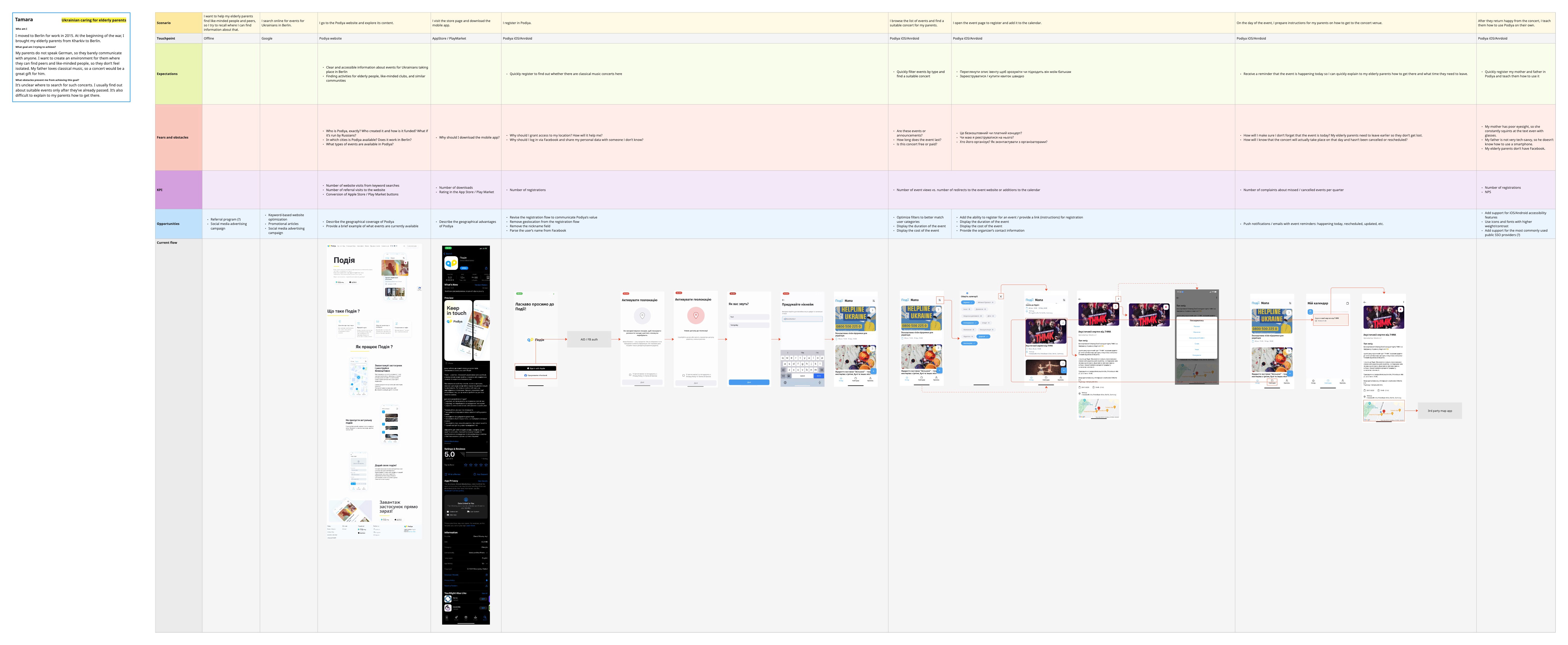
Strategic approach
Based on the research and journey maps, I worked with the team to redefine Podiya’s value proposition: “Help displaced Ukrainians easily find local events, connect with the diaspora, and join or build communities that support their emotional well-being.”
To deliver on that mission before applying for grants, I defined three strategic directions:
Make discovery predictable — highlight proximity, clarity, trust, and immediate relevance.
Empower newcomers to contribute — make hosting an event feel simple, supported, and safe.
Support planning and reduce mental load — ensure users can save events and receive timely reminders.
These principles informed the IA, content model, navigation, and visual design across the entire product.
Key design areas
Below is each major design area, now with a clear rationale before the visual explanation.
Event discovery & Map view
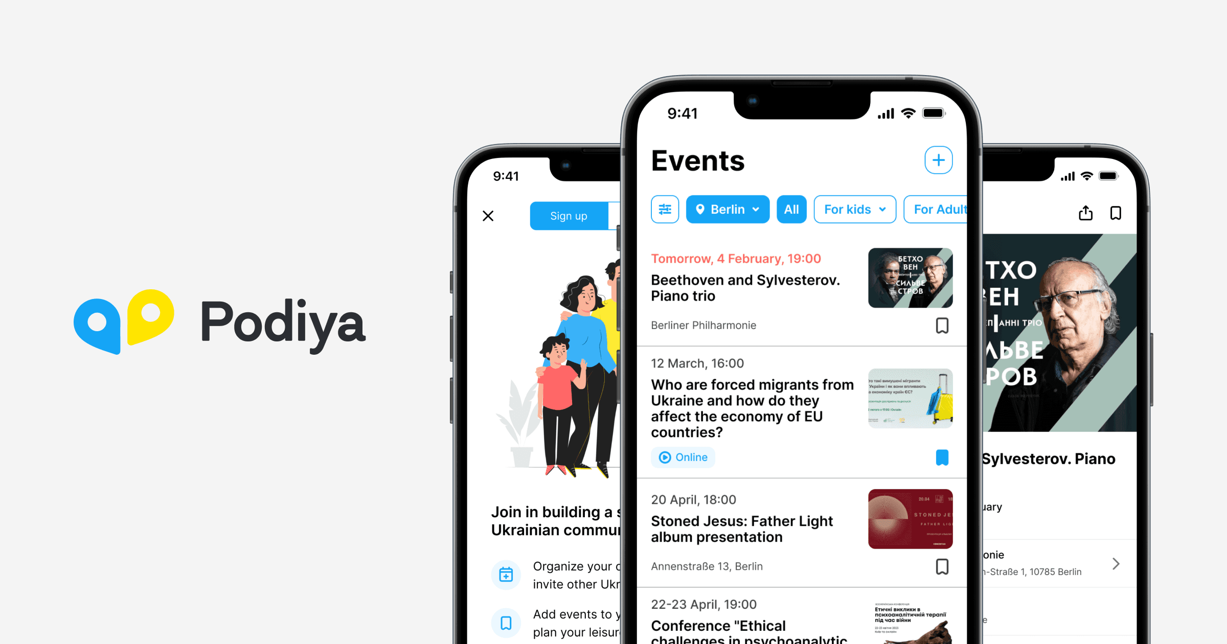
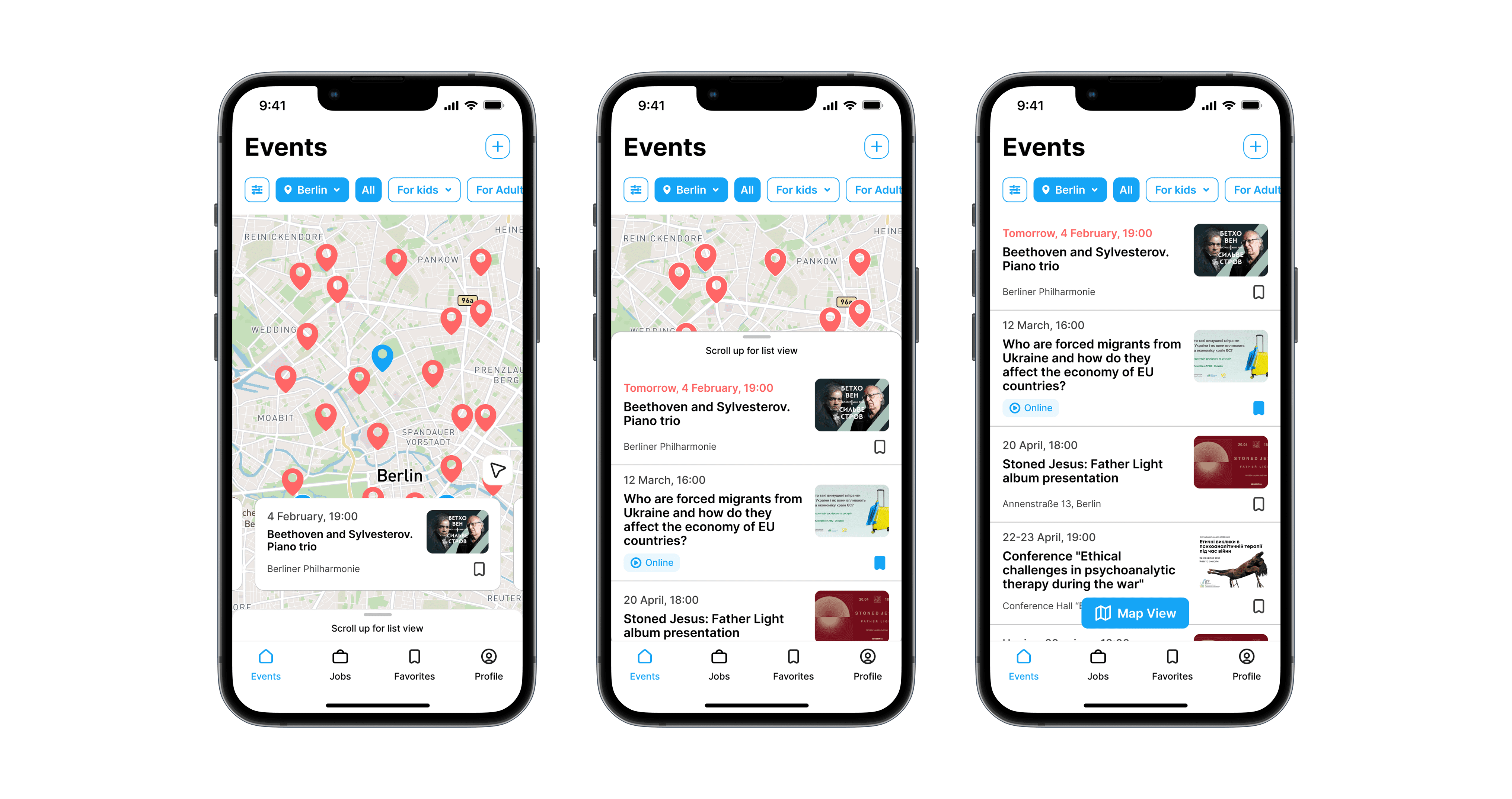
We moved to a map-first design because displaced users evaluated events primarily based on proximity and safety. A spatial layout reduces uncertainty, accelerates scanning, and helps users orient themselves in unfamiliar cities. I redesigned the browsing experience around a real-time map, supplemented by structured filters and trust-enhancing event cards. This allows newcomers to explore neighborhoods, identify nearby gatherings, and compare options at a glance.
Event cards highlight credibility and clarity—organizer identity, distance, date, and type—because research has shown that missing trust signals lead users to abandon events. I consolidated all critical signals into a predictable card format that removes guesswork and makes quick decisions easier.
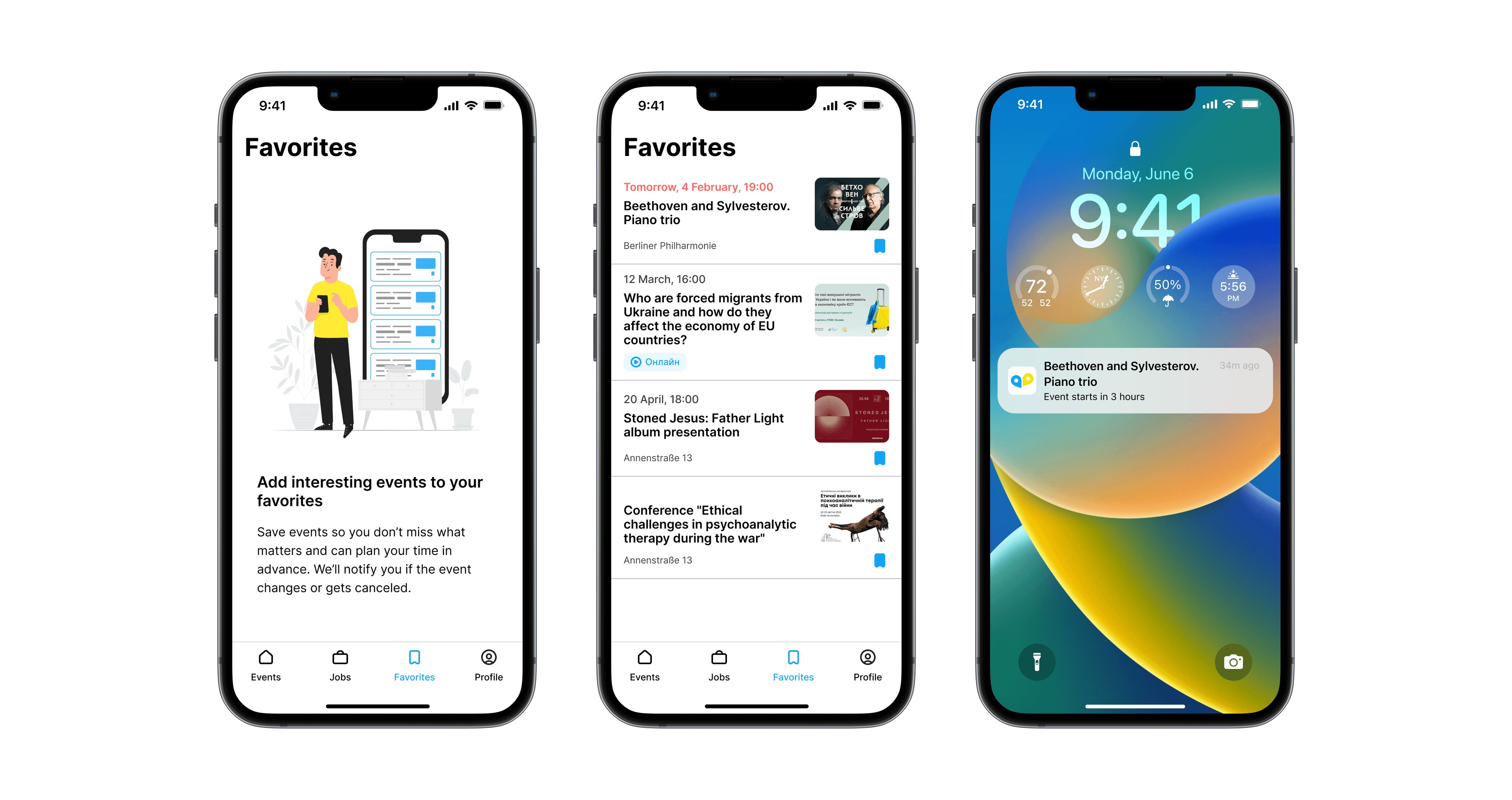
Favorites & reminders
Users discovered events early but later forgot about them. A lightweight save-for-later flow paired with reminders reduces memory load and increases participation. I designed a simple two-tap saving system with push notifications that fire shortly before an event, helping users plan their time without cognitive strain.
Event management
First-time organizers felt anxious about “doing something wrong.” A guided flow reduces uncertainty and empowers volunteers to contribute confidently. I rebuilt the full event creation flow as a step-by-step structure that surfaces only necessary decisions at each stage while ensuring clarity through microcopy and preview states.
Job market integration
Stability and belonging go hand in hand. Integrating curated job listings from UA Talents allowed Podiya to support both social and economic resilience without bloating the core experience. I designed the Jobs section as a lightweight, reliable extension of the platform, displaying vetted volunteer-based openings relevant to displaced users.
Pitch deck for fundraising
Aligning stakeholders around a unified narrative was critical. I grounded the pitch deck in validated user needs to demonstrate how design clarity translates directly into community impact and volunteer efficiency. I contributed to the deck’s structure, framing, and visuals to help the team communicate the product’s mission and readiness to potential partners.
Outcomes
The redesign produced tangible improvements across usability, clarity, and operational reliability:
Testing showed increased confidence in browsing and choosing events, significantly higher task completion, and reduced hesitation across all redesigned flows.
Volunteers found it easier to host gatherings, resulting in more events being published.
The platform gained a unified IA and content structure, enabling the team to scale new features with far less friction.
The pitch deck helped the team articulate Podiya’s mission with clarity and attract new supporters.